A head shot of Caleb Winters smiling. Caleb is a white man with short brown hair and blue eyes, wearing a gray t-shirt

Caleb Winters

Senior Product Designer

Hello, I'm Caleb. I'm an all-around product designer specializing in user experience and front-end code. I have a strong background working on developer experience products. I've also designed products for PMs and administrators.

Most recently I worked at GitHub where I helped to ship GitHub Projects, repository rules and properties, GitHub Marketplace, and more.

Email me if you'd like to work with me. 😊
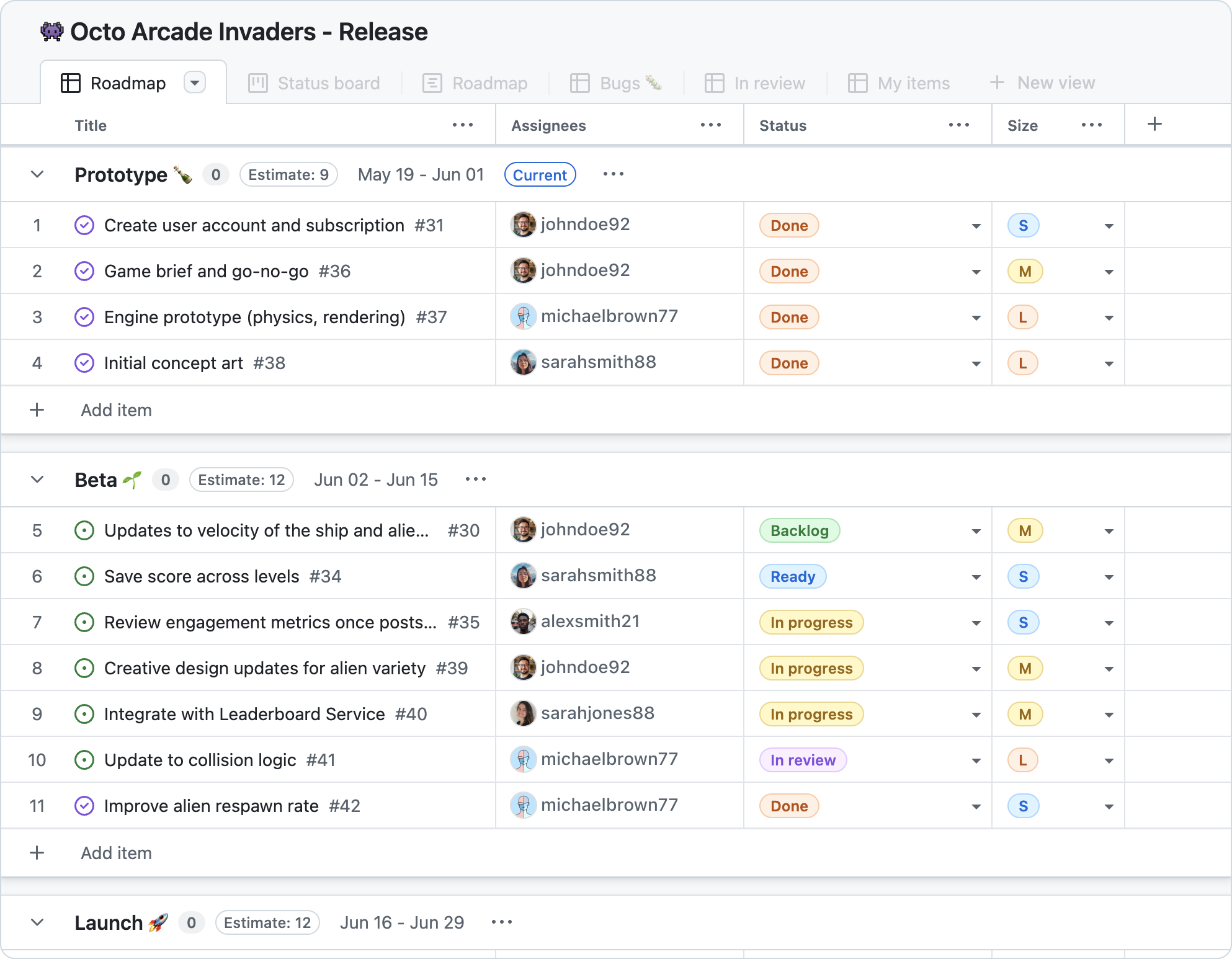
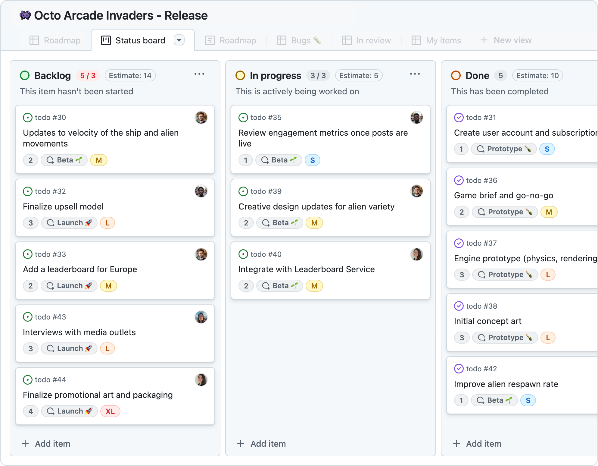
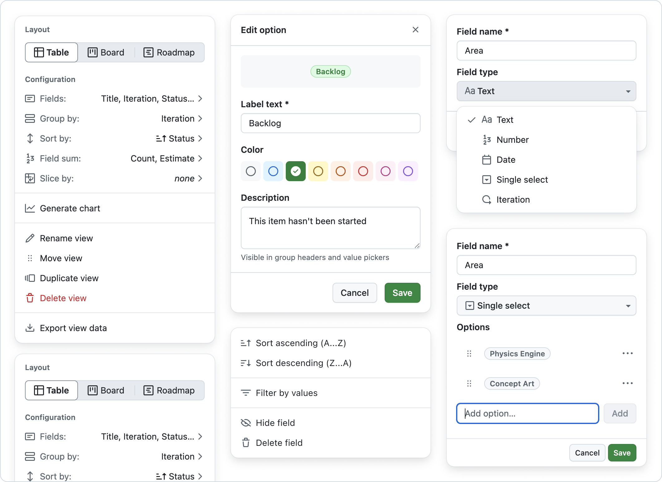

GitHub Projects

I helped design a 0-1 project management app that replaced the legacy Projects Classic. Started from scratch. Worked with PMs and engineers to shape, design, ship, and iterate on the app. Introduced custom fields and draft issues. Helped design some custom components that were later modified and added to our design system, Primer.

This image shows a project management table for 'Octo Arcade Invaders - Release'. It is divided into three sections 'Prototype', 'Beta', and 'Launch'. Each task has a cell for 'Assignees', 'Status', and 'Size'. This is a project management board view. It has three columns 'Backlog', 'In progress', 'Done'. Each column has tasks displayed as cards. Each card has the title and assorted metadata. This images shows some assorted popover menus from GitHub Projects. 'Layout' for configuring view settings and choosing between table, board, and roadmap layouts. 'Edit option' for configuring enum options and choosing a color. There is a column menu for sorting, filtering, or hiding the column. There are also two menus that show moments from creating a custom field. A custom field can be 'text', 'number', 'date', 'single select', or 'iteration'

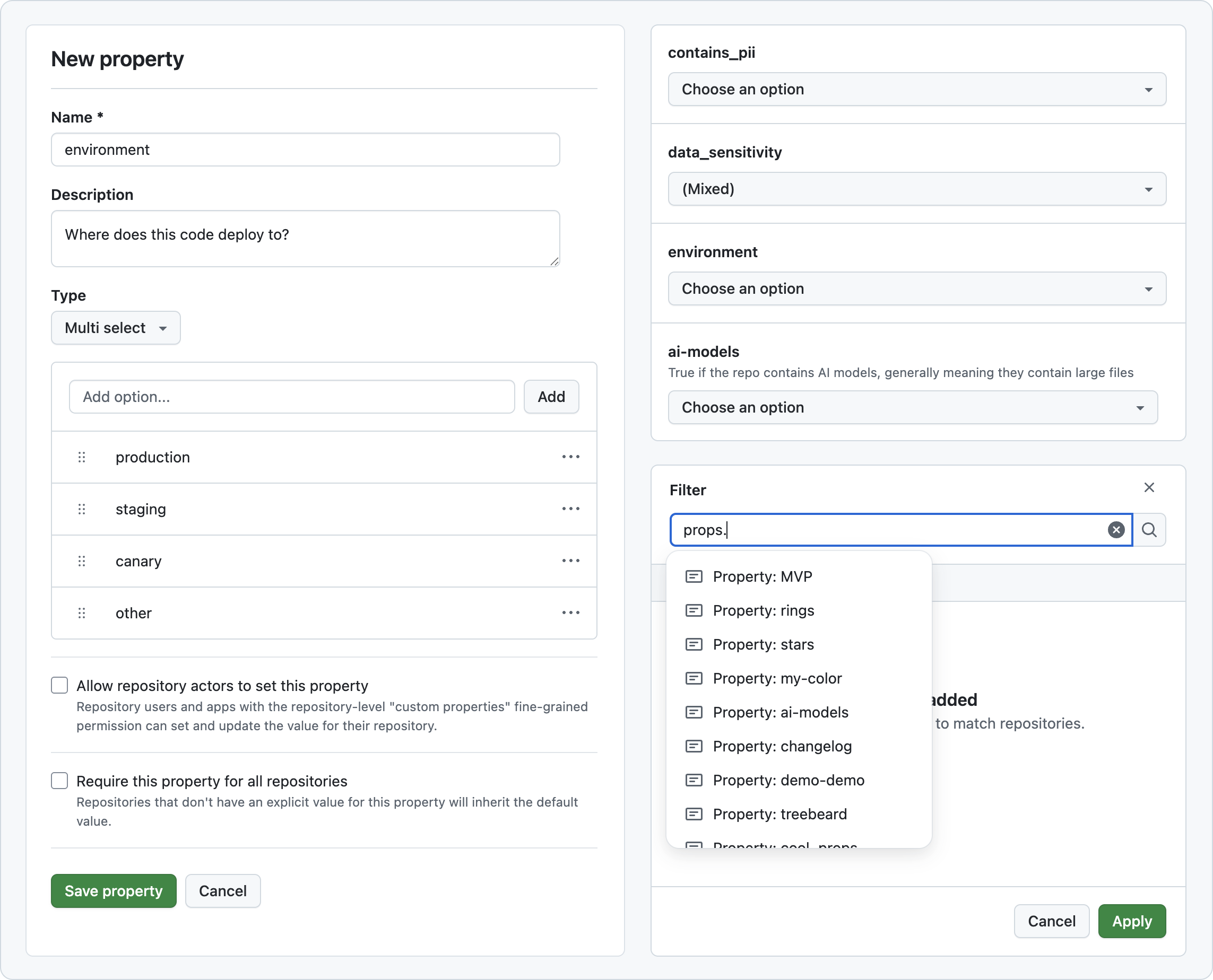
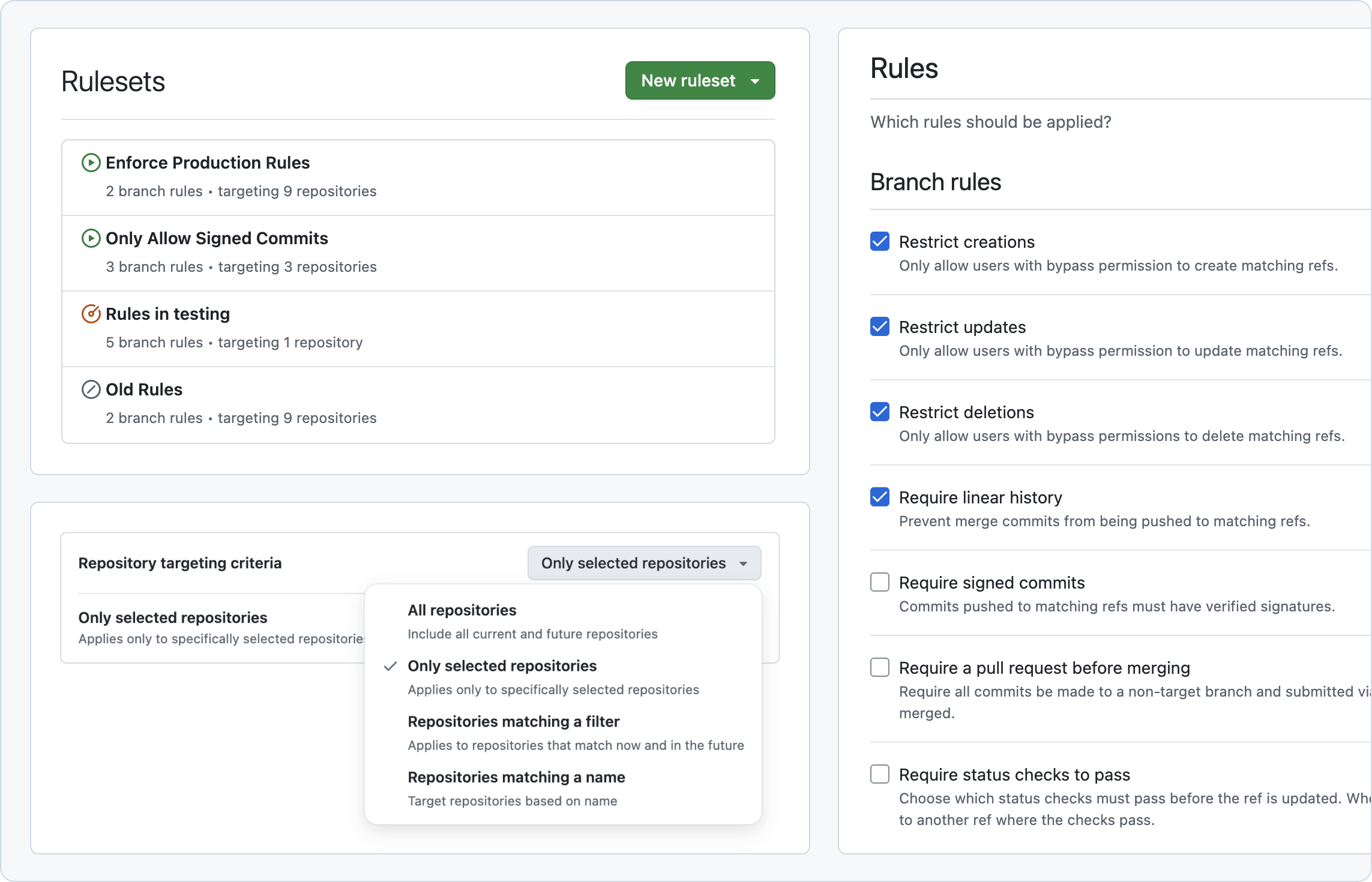
Repository Governance

Designed and shipped features to help enterprise admins manage repository policy at scale. I helped to design and ship custom properties and repository rulesets. Worked with engineering to deliver a user experience that aligned with our API.

This image shows three different pieces of the Repository Properties UI. First there's a 'New property' form with fields for name, description, and type. 'Multi-select' is selected as the type, and there is a list below to add multi-select value options. Second, there is a form for setting property values on a repository. It's a list of four properties. Each property label has a dropdown button underneath it that can be used to select a value. Third, there is a filter dialog. The dialog has a filter input a the top. The input is focused and the autocomplete menu is open. The autocomplete menu shows the names of several custom properties. This image shows three pieces of the rulesets UI. First there is a list of rulesets. At the top there's a page header that says 'Rulesets' with a trailing button that says 'New ruleset'. Each list item has a ruleset title and an icon to indicate its enforcement status. Second, there's a repository picker with two sections. The top section allows you to choose your repository targeting criteria. The dropdown button for this is open and there's a single-select menu visible with options for 'All repositories', 'Only selected repositories', 'Repositories matching a filter', and 'Repositories matching a name'. The menu overlays the bottom row of the repository picture, hiding its contents. Third, there's a checklist of several branch rules. About half the rules are checked. Some examples of these rules are 'restrict creations', 'restrict updates', and 'restrict deletions'.

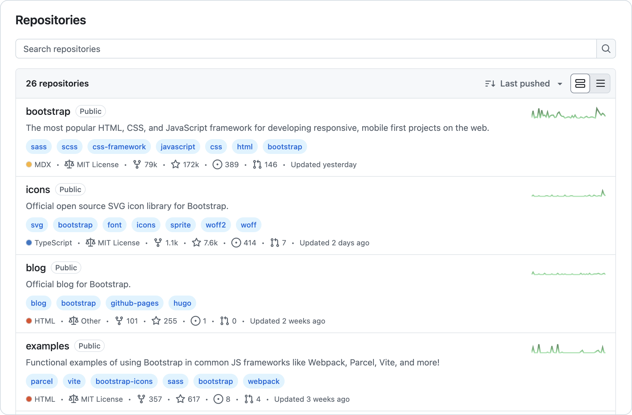
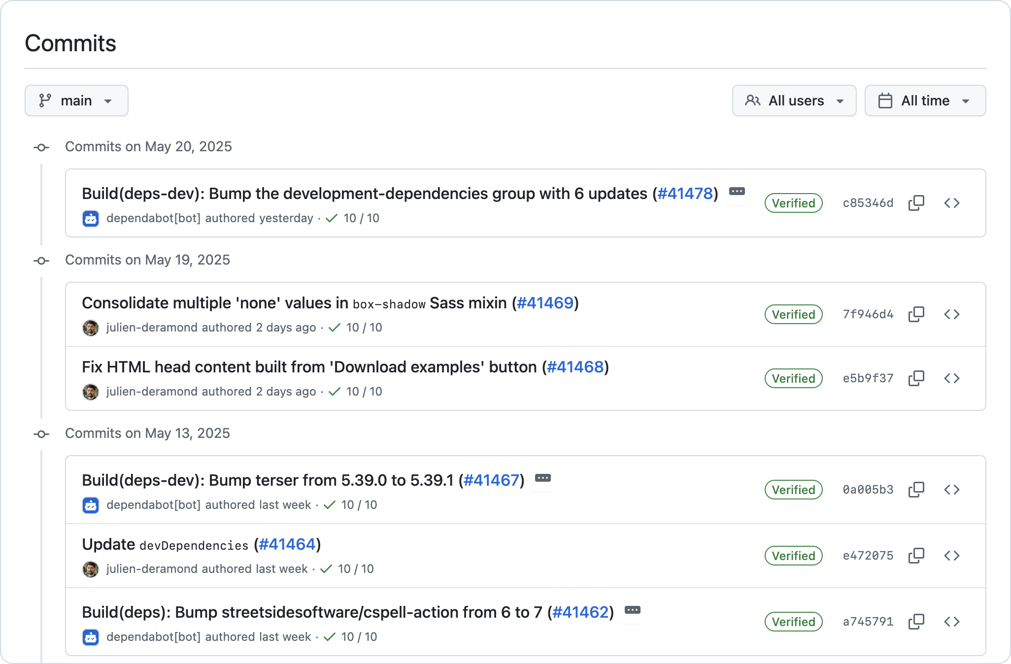
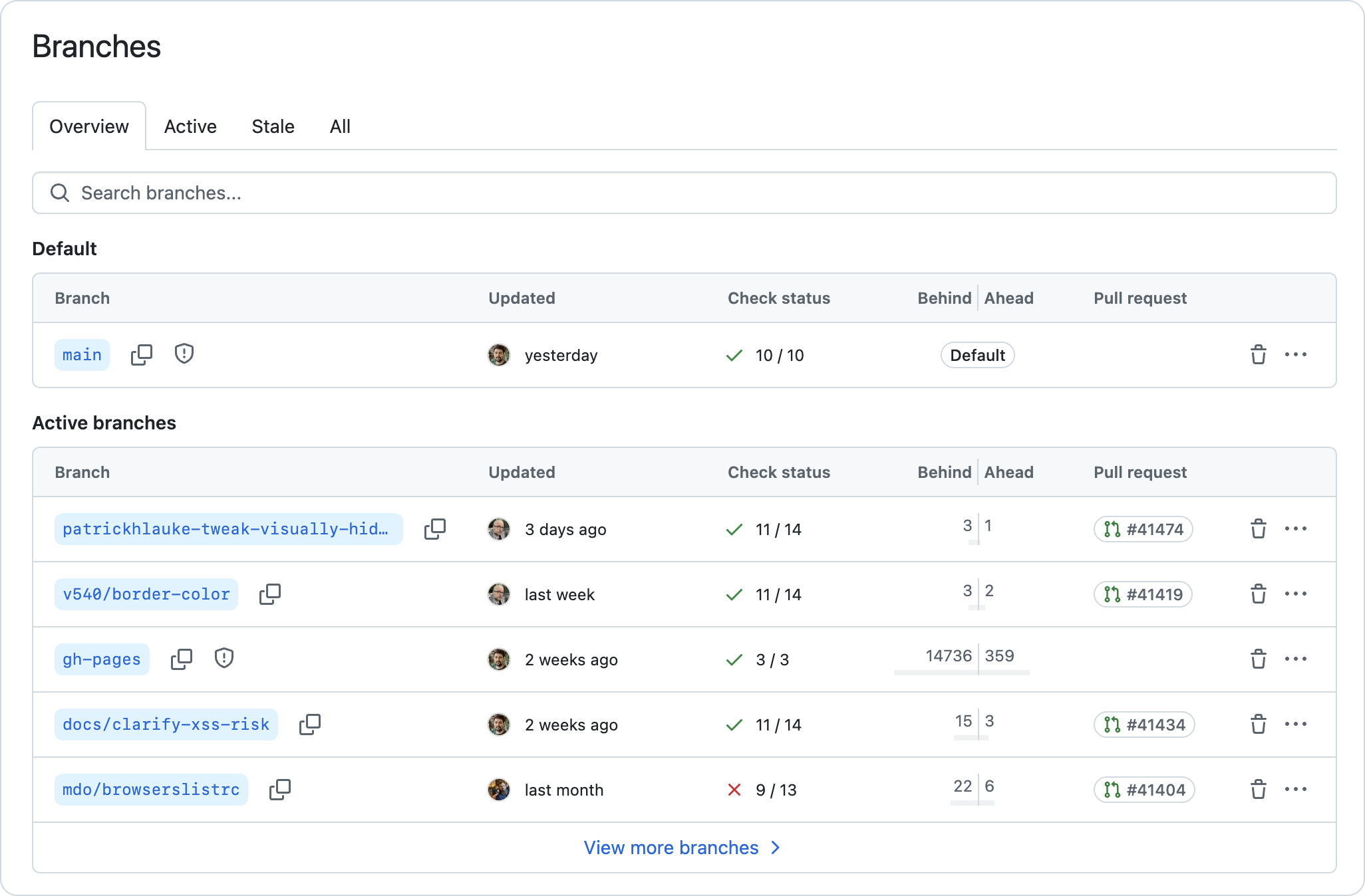
Repository Design Refresh

Refactored the design of the repository index, commits, and branches pages to align with Primer
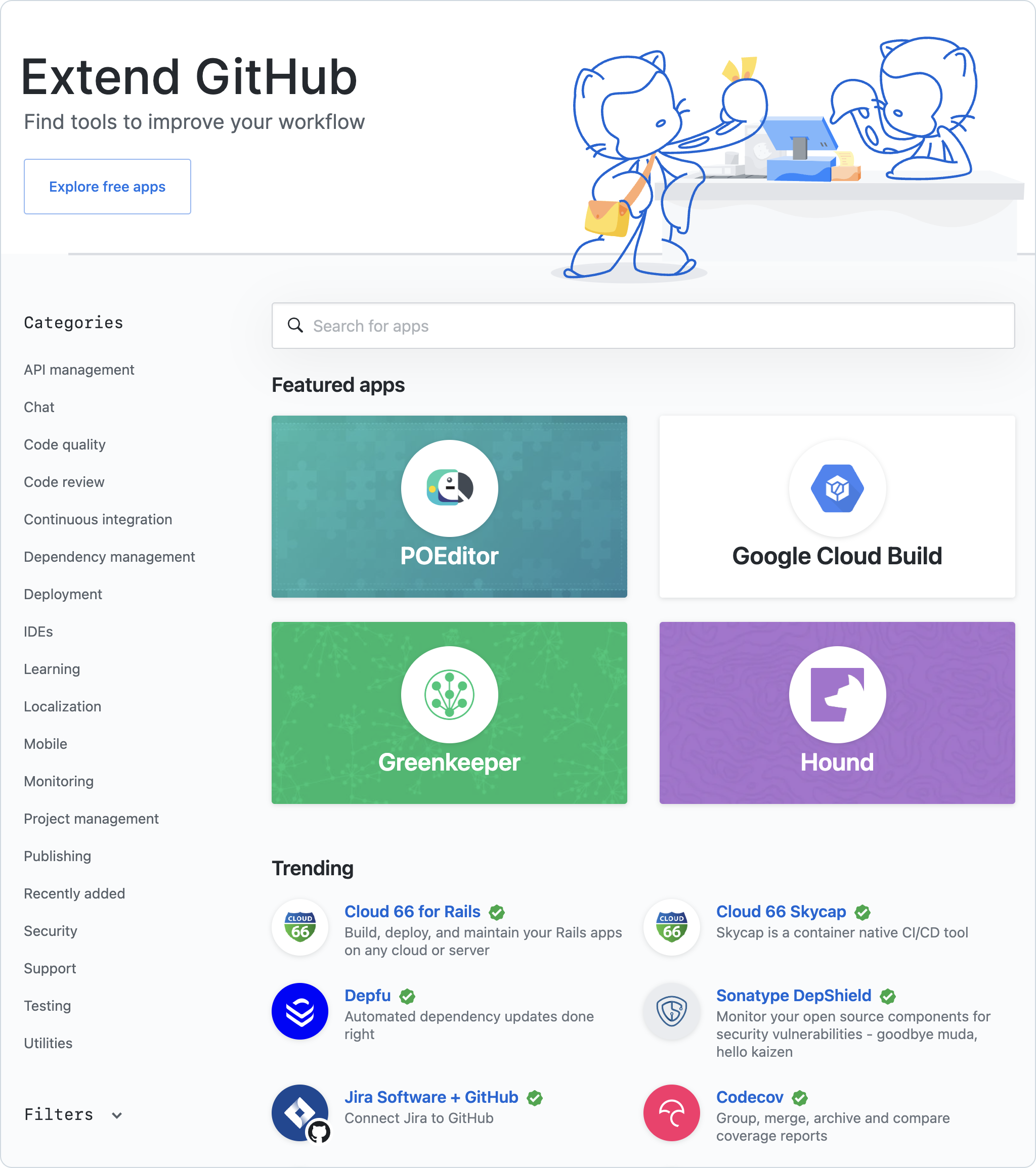
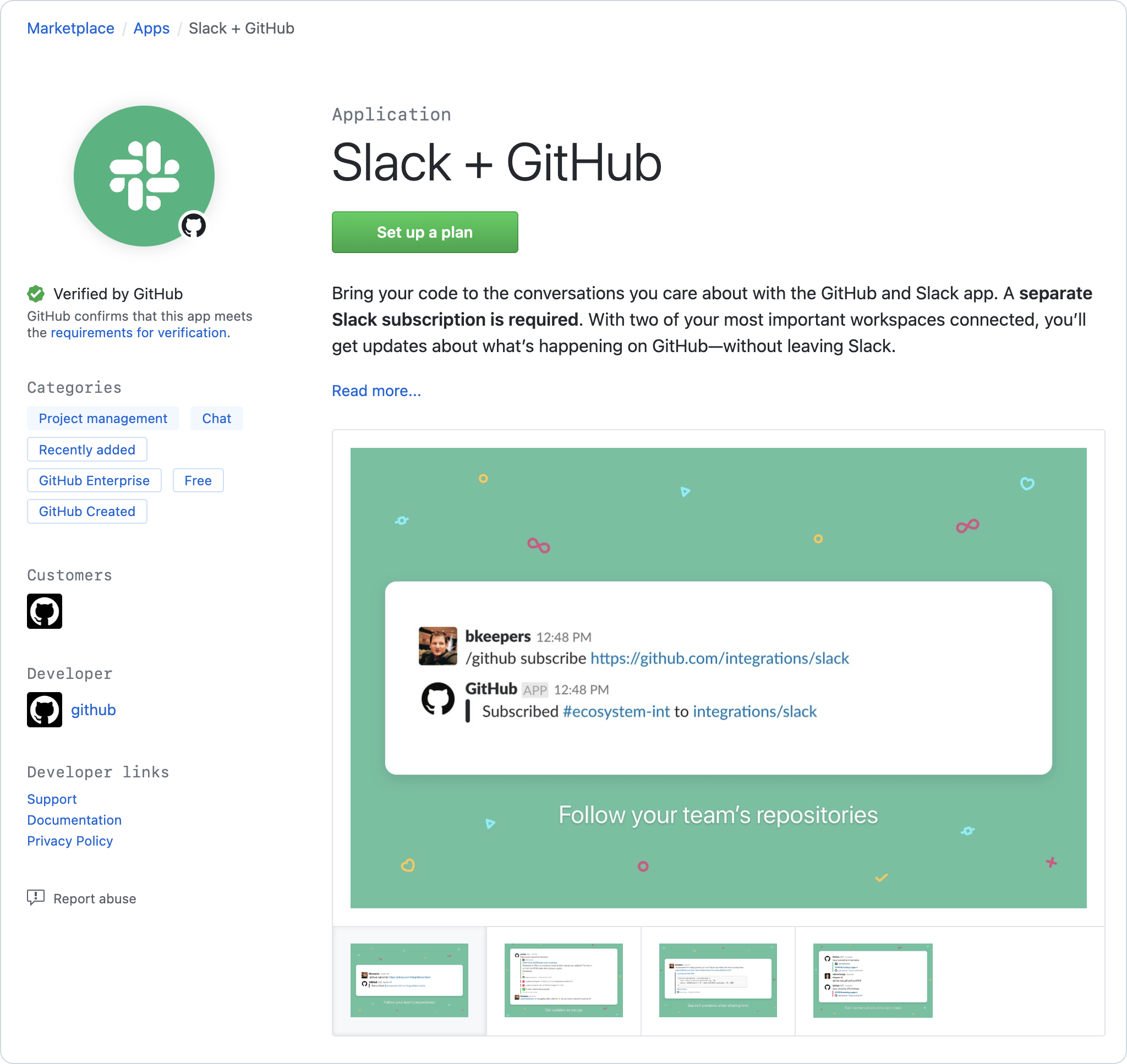
This image shows a list of repositories with a search bar at the top. Each list item has a repository title, description, topic tags, an activity sparkline, and some supplementary metadata. This image shows a list of commits arranged on a timeline. The timeline has points for dates. For each date, there is a list of commits nested underneath. Each list item has a commit message, commit author, a verification badge, a link to the commit SHA, and a code icon button. This image shows a data table with branch names. The `main` branch appears in a second, separate table up at the top. Each table has columns for 'branch', 'updated at', 'check status', 'behind | ahead', and 'pull request'. Each row also has two trailing icon buttons. There is a trashcan button for deleting a branch. There is a horizontal kebab button for opening an action menu

GitHub Marketplace

Worked on self-service tools for developers to manage their Marketplace listings. Led a design refresh of the Marketplace to update the visual design and introduce GitHub Actions to the Marketplace.

This image shows an index page for an app marketplace. At the top there is a decorative header with a search bar. On the left there is a sidebar menu with categories such as 'API management', 'Chat', and 'Code quality'. At the top of the main area there is a section called 'Featured Apps' that has four applications displayed on large colorful tiles. Below this, there's a section called 'Trending'. Here there's a simpler list of apps displayed in a two-column grid. This image shows a marketplace listing for the application 'Slack+GitHub'. There's a big call to action button that says 'Set up a plan'. On the left there's an avatar for the app, a 'verified by GitHub' line, and some additional metadata. The main section is on the right. It has a longform application description and an image gallery.

Experience

2015—2025

Senior Product Designer @ GitHub

2014—2015

Founding Designer @ Screenbeacon

2012—2014

Senior Designer @ ZURB

2010—2012

Software Designer @ Digital Corps


Education

2006—2010

BFA, Visual Communications @ Ball State University

Muncie, IN